Monday, October 19, 2009

on books and fingers


Image from DesignObserver

Recently, Design Observer ran a piece about Google Books, entitled Why Is Google Giving Us the Finger?. While there has been a lot of discussion—and a whole lawsuit—around the Google Books project, there has been very little said about the realities of it, including how the books are to be scanned and entered into the database. Having worked on the publishing side, I know that Google is far slower than Amazon or other sites at scanning and uploading digital versions of new books, and I imagine performing these processes on older books is a far more difficult process. (You can't just send Google a PDF of a book that's been out of print for a few decades.)

If nothing else, the article is worth reading for this gem:
I was surprised that Google didn’t make use of a higher class of scanner. And I was really surprised by what happened next: like a dirty photo falling from between the pages of a book, a photograph popped up.
It showed the hand of whoever fed pages into the scanner — a hand with a latex sheath on its index finger, like a condom. The person’s nails were nothing to brag about. The condom and the nails, combined with the sudden, unexpected appearance, made the picture seem obscene and unhealthy. I thought with horror of the guy who found a finger in his bowl of fast-food chili.
This is the feeling of humanity—or, perhaps more correctly, human error—creeping in on what we consider to be a soulless, animatronic process. Unless you are familiar with the process of scanning books, or unless you have worked in a library, or unless you understand the Google Book project, you would of course be shocked to see this fragment of behind-the-scenes action in what could be considered an end product. Personally, I love finding these surprises in projects—it shows that there was thought and care put into the project, which makes it feel more real to me. But maybe I'm just more of a humanist than most.

Sunday, October 18, 2009

on encouraging kindness


Image from cabel.name

Have you ever been served something that isn't what you ordered? Not just that it wasn't cooked to your liking, or that there was real milk instead of soy, but something completely different?

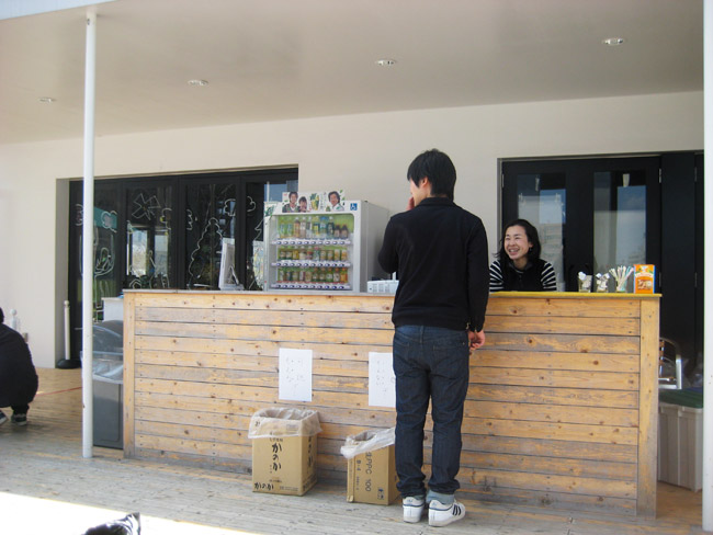
The Ogori cafe takes that same experience—which is almost never pleasant—and transforms it into a whimsical experiment about kindness.

Cabel Sasser, co-founder of Panic Inc., wrote up a description of his visit to the Ogori cafe. It's the sort of thing that can bolster your faith in humanity, or leave you with a grin for the rest of the day. From the piece:
For the record, here are the rules of the Ogori cafe:

1. Let's treat the next person. What to treat them with? It's your choice.
2. Even if it's a group of friends or a family, please form a single-file line. Also, you can't buy twice in a row.
3. Please enjoy what you get, even if you hate it. (If you really, really hate it, let's quietly give it to another while saying, "It's my treat…")
4. Let's say "Thank You! (Gochihosama)" if you find the person with your Ogori cafe card.
5. We can't issue a receipt.

The Ogori cafe was an unforgettable travel moment, and an idea that has stuck with me: It was a complete surprise in our day. It encouraged communication between total strangers or, in this case, members of the Kashiwa community and a couple of weird guys from Oregon. It forced one to "let go", just for a brief moment, of the total control we're so used to exerting through commerce. It led you to taste something new, that you might not normally have ordered. It was a delight.
While it must be understood that the Ogori cafe is something of an art installation piece, constructed to serve one specific, brief purpose, the realizations it brings about human interaction and kindness can certainly carry over into other realms. In stressful situations, such as receiving something different from what you expected or asked for, the first thing we usually want is to resolve the situation immediately. How often do we think of how to turn that same situation into something beneficial not only to ourselves, but to others, as well? And how many other situations might we design better, to improve people's quality of life through what might otherwise be understood as mistakes or problems?

As a final note, Panic Inc. is part of the team behind the video games Katamari Damacy and Noby Noby Boy, which both encourage exploration in a fun, vibrant world—exactly the kind of experience which the Ogori cafe seeks to create. Life imitating art, perhaps?

Wednesday, October 14, 2009

on 'kindle killers', mark ii

Apparently I jumped the gun a little & didn't do as much research as I should have! This morning, FastCompany published an article with images of the new B&N eReader and discussed what the technology means for eBooks in general.


But the lower LCD is where everything gets much more exciting: it's a 480 x 144 pixel screen (at 150dpi) that takes up the bottom fifth of the whole e-reader, and it's designed for doing all those nice graphical extras that an e-ink display just can't do. Things like full-color CoverFlow-esque book cover browsing, advanced menu control, touchscreen keyboard, and perhaps social-net chatting. This last is suggested by the rumored social-net tie-ins built deep into B&N's device, which also explains why the sparse button interface of the machine includes a user-profile button.
This is the kind of innovation that is a great first step. Social networking via books is something that seems so obvious—reading is necessarily a solitary act, but experiencing stories after reading is anything but—and yet the Kindle does nothing with this potential. I hope that Barnes & Noble makes an effort to communicate with publishers and authors to develop works that can fully utilize their technology. Without this kind of collaboration and communication, the potential of their new eReader will remain in potentia.

on the design process


Image from FastCompany.

I bookmarked this short piece by Joe Duffy in FastCompany on Monday, and thought I'd post a little here. From the article, "Demystifying Design: An Argument for Simplicity":
The best strategy behind design is all about collection and collaboration--of people, talents, ideas, perspectives. It's about truly seeing vs. just looking. It's about being curious about what you're seeing, what it means or what it could mean if used in a new way or combined with other ideas or images. It takes a certain appetite and ability to digest. Honestly it's simple. The best talent understands that.
...
To be successful, the business of design must deliver truth and unique beauty. To breakthrough, design must deliver creative differentiation.

(emphasis mine.)

I can't agree with this more. It's rare that I don't have much to say in response to a post, but Duffy's short piece—dare I say axiom of sorts—was so spot-on I can't do much but repost.

on 'kindle killers'

Last week, the internet saw a quiet buzz begin about Barnes & Noble's latest eReader, which is currently still in development with PlasticLogic. FastCompany and Endgadget both had short features about the 6" device with a color screen, which was revealed by Daniel Joresson at CTIA:


Color me unimpressed. Despite how enthusiastic the tech community might be about the potential of color screens on eReaders, I don't believe that this technology will be sufficient to rejuvenate the eBook market. What we need is not another system to code for, another set of dimensions to reformat books to, another format to sell a product in. (ouch, those prepositions.) What we need is better communication between artist (writer, designer) and producer (publisher). This is impossible in a world where the final format is dictated by the seller (Amazon, Barnes & Noble).

Don't get me wrong—I'm exuberant about the potential of the eBook format. I love that we are able to read millions of books on one small device, anywhere, at any time. But I think this is just the beginning. We need more innovation in the world of eReaders and eBooks, and not just adding a few colors to our already-existing text reader. Come on, world. Let's see what we can do with this.

Monday, October 5, 2009

on redesigning logos

Here's another! To be filed under "terrible new logos":


Image from Yale Daily News

Yale has decided to redesign their logo to be more in keeping with the university's brand, completely dropping the iconic design created by famous graphic designer (and Yale alumnus) Paul Rand in 1985. From Yale Daily News:

The Yale University Press began phasing out its distinctive logo, designed in 1985 by acclaimed graphic designer and former School of Art emeritus professor Paul Rand, in books published this fall, Yale University Press Director John Donatich said. And while it has not yet removed the logo from its Web site, the Press will now feature the word “Yale” in the University’s official typeface along the spines of new books — in what observers described as an effort to bring Yale and the press closer together.

I was never all too crazy about the original logo, to be honest, but the redesign doesn't look like a logo at all. I'd rather see some effort being put into a brand, rather than simply a typeface selection.

on refuting the line that "print is dead"

I have so many draft-posts that will soon appear here (backdated), but before I get to those, some breaking news. From the New York Times:
Condé Nast plans to announce this morning that it will close Gourmet magazine, a magazine of almost biblical status in the food world; it has been published since December 1940.
There's been a lot of talk very recently about whether print is dead—the Village Voice a few days ago ran the front-page headline "PRINT IS UNDEAD"—and major magazine closings like this tend to add fuel to the fire. Condé Nast has been going through some significant changes as a company, but Gourmet's folding should not be taken as symptomatic of the print industry as a whole.

According to MinOnline and MrMagazine, last month (September 2009) saw the launch of 71 new magazines, 18 of which will publish at least quarterly. While major companies might be unable to support offshoot ventures (which may include magazines), small companies and independent presses show no sign of slowing down publication.

Gourmet might be gone, but print will undoubtedly continue to live on.